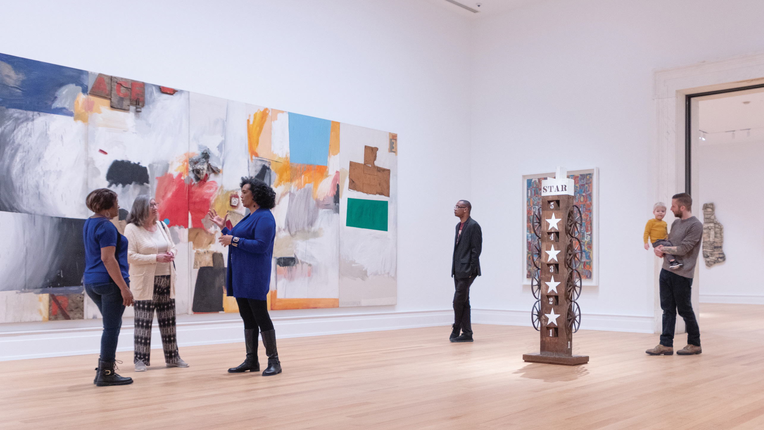
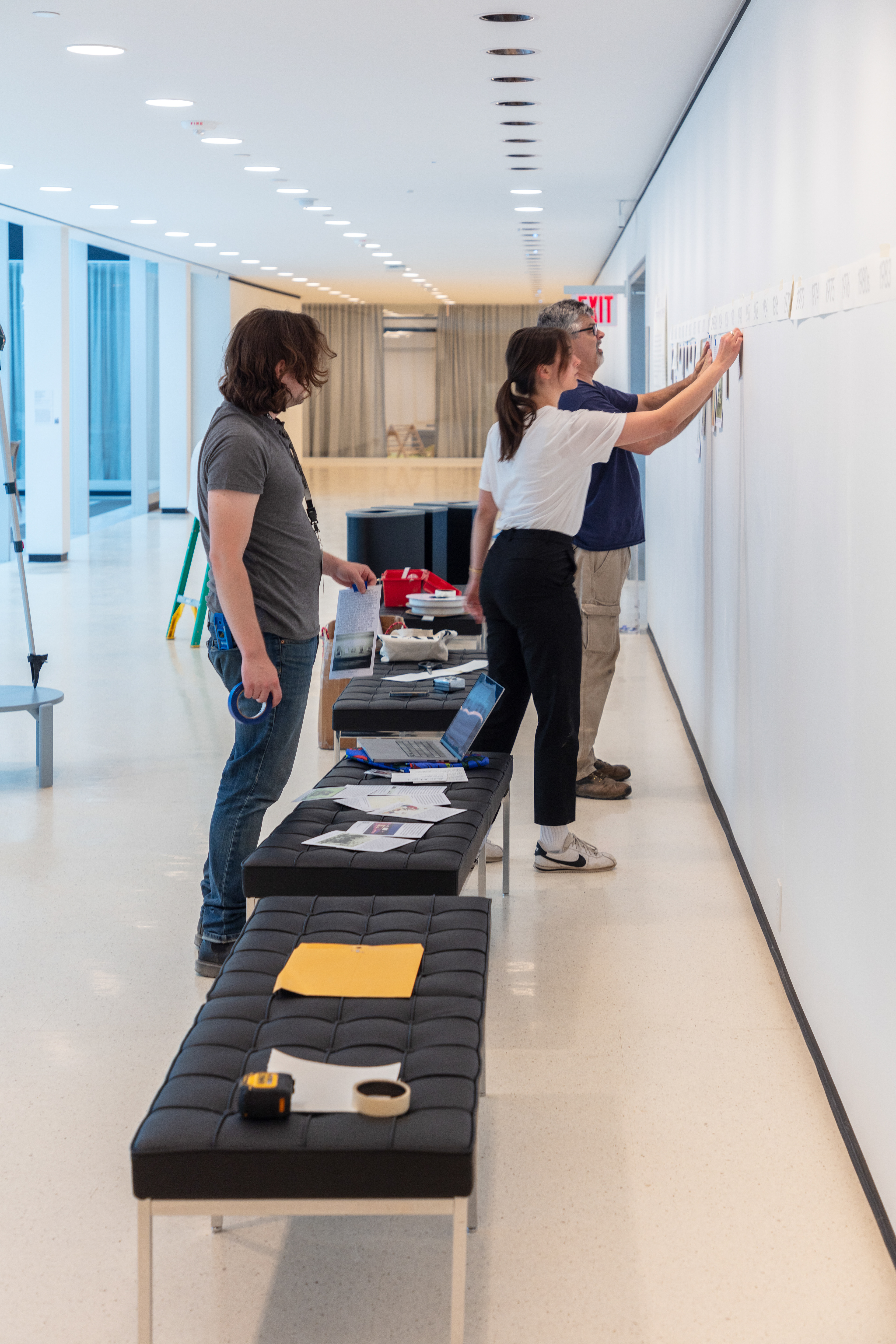
Thinking ahead of opening day to the visitor experience, there is a lot that’s involved in helping the visitor navigate and enjoy the museum in its fullest.
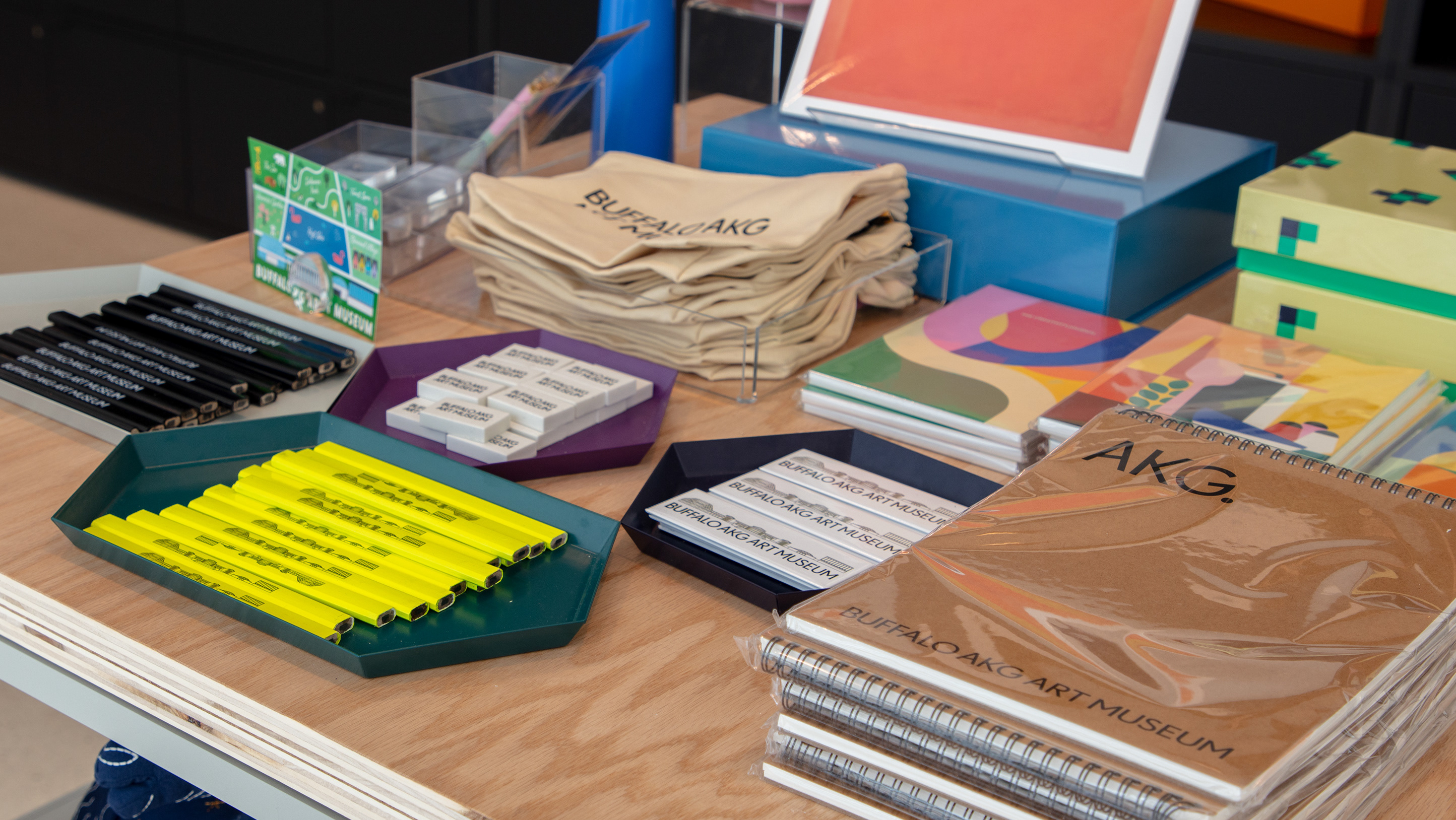
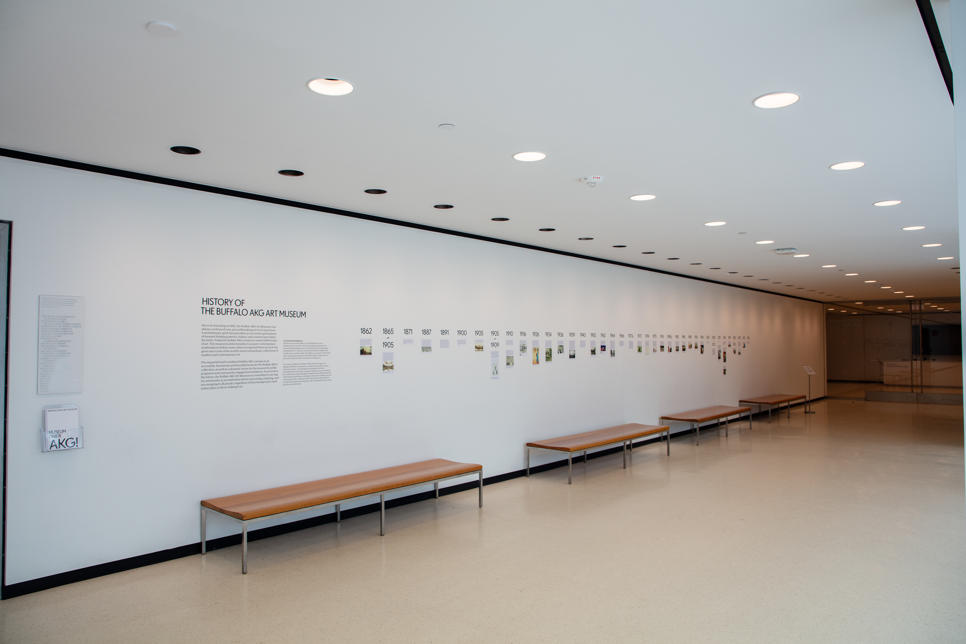
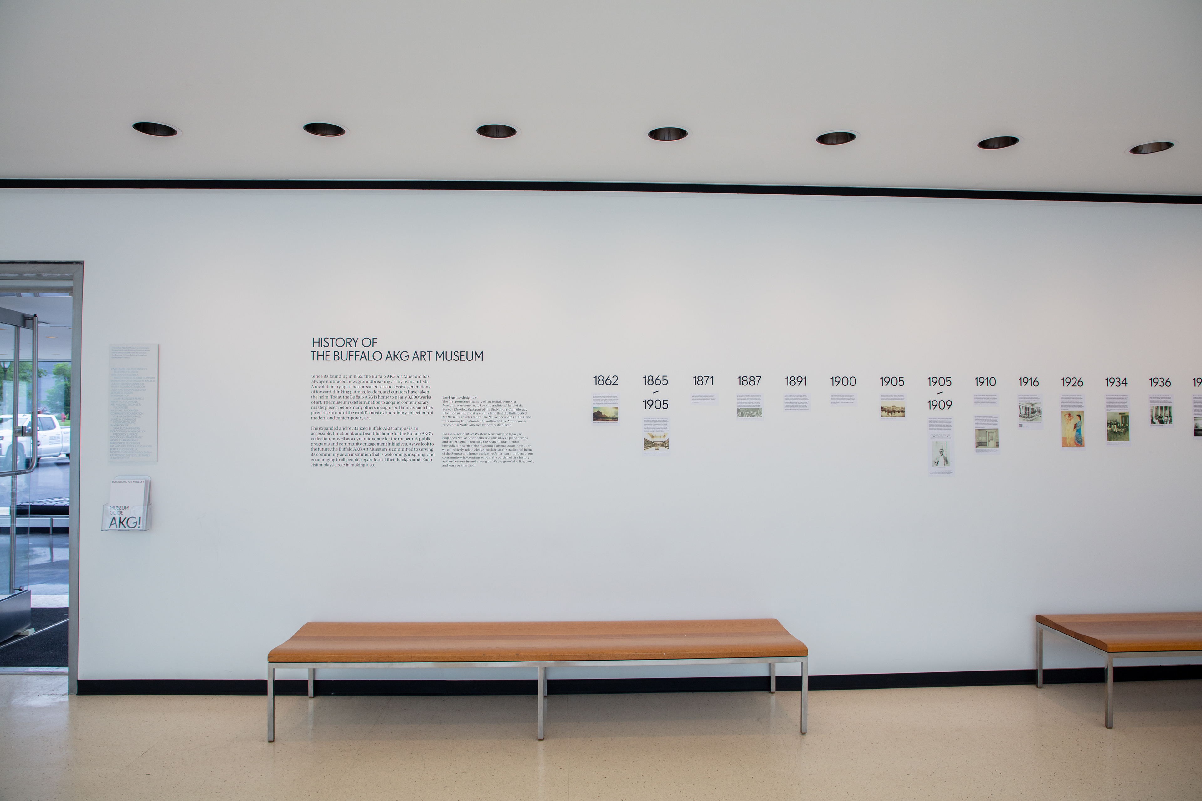
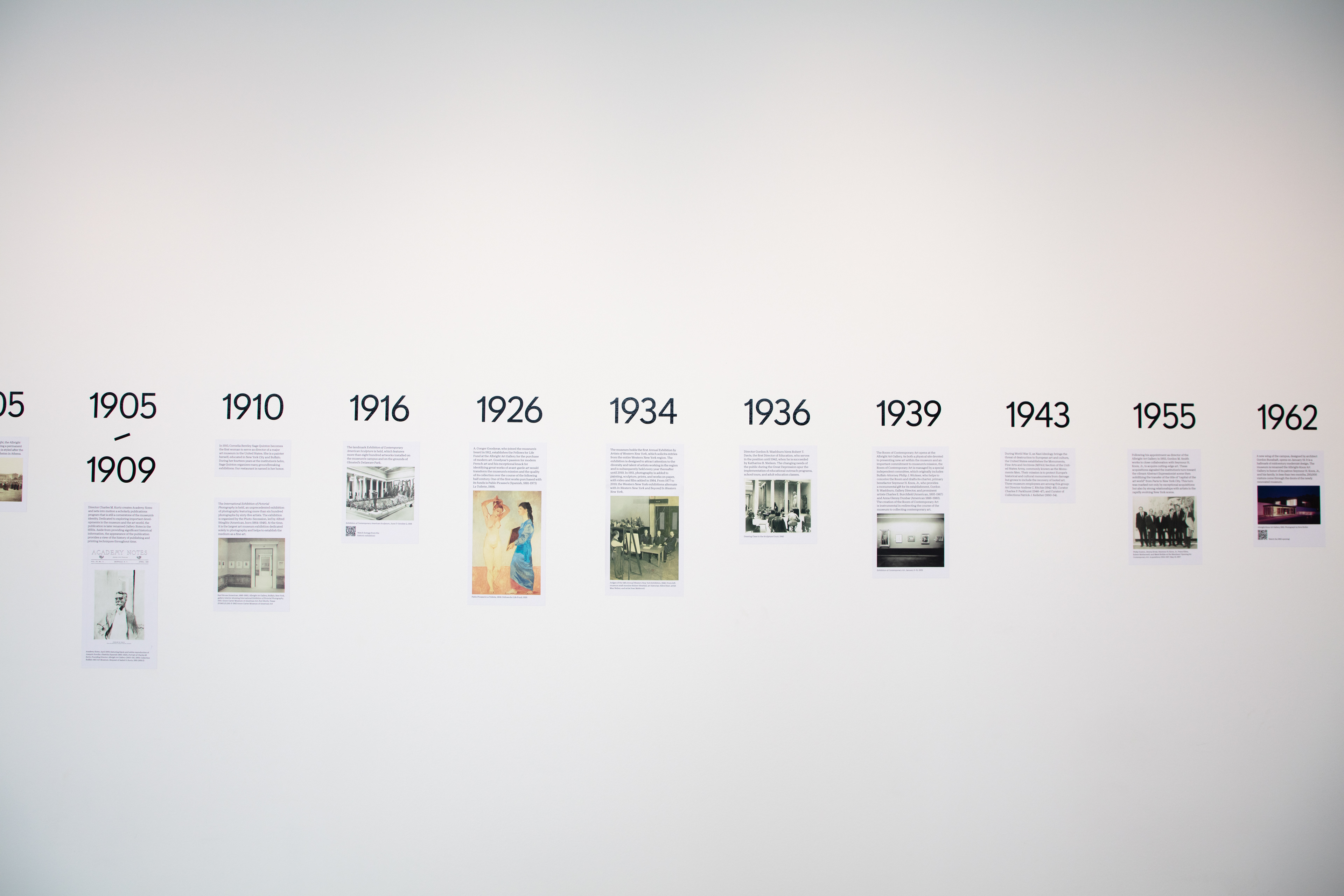
Some of these materials include purely functional things such as a map, way-finding, tickets, admission tags, supplemental vinyl instructions, etc. Other materials are functional, but also graphic enhancements such as this historical timeline of the museum, which gives people something interesting to read while they wait in line or take a break, and makes the space feel more full.
Each of these projects were crucial in rounding out the experience for visitors.
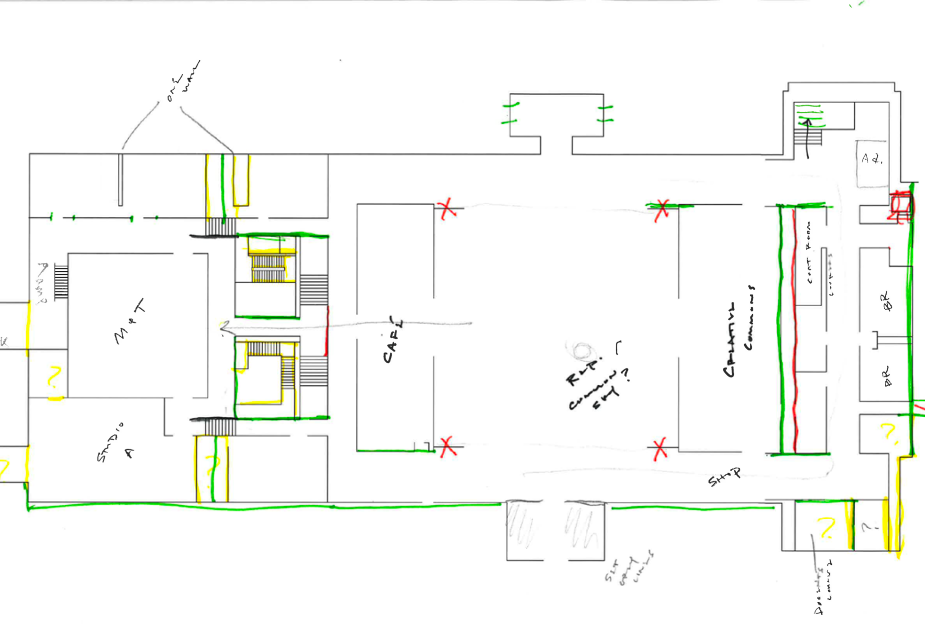
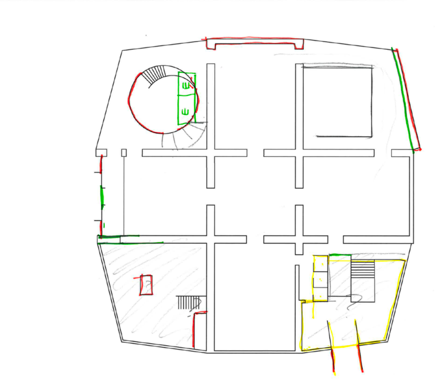
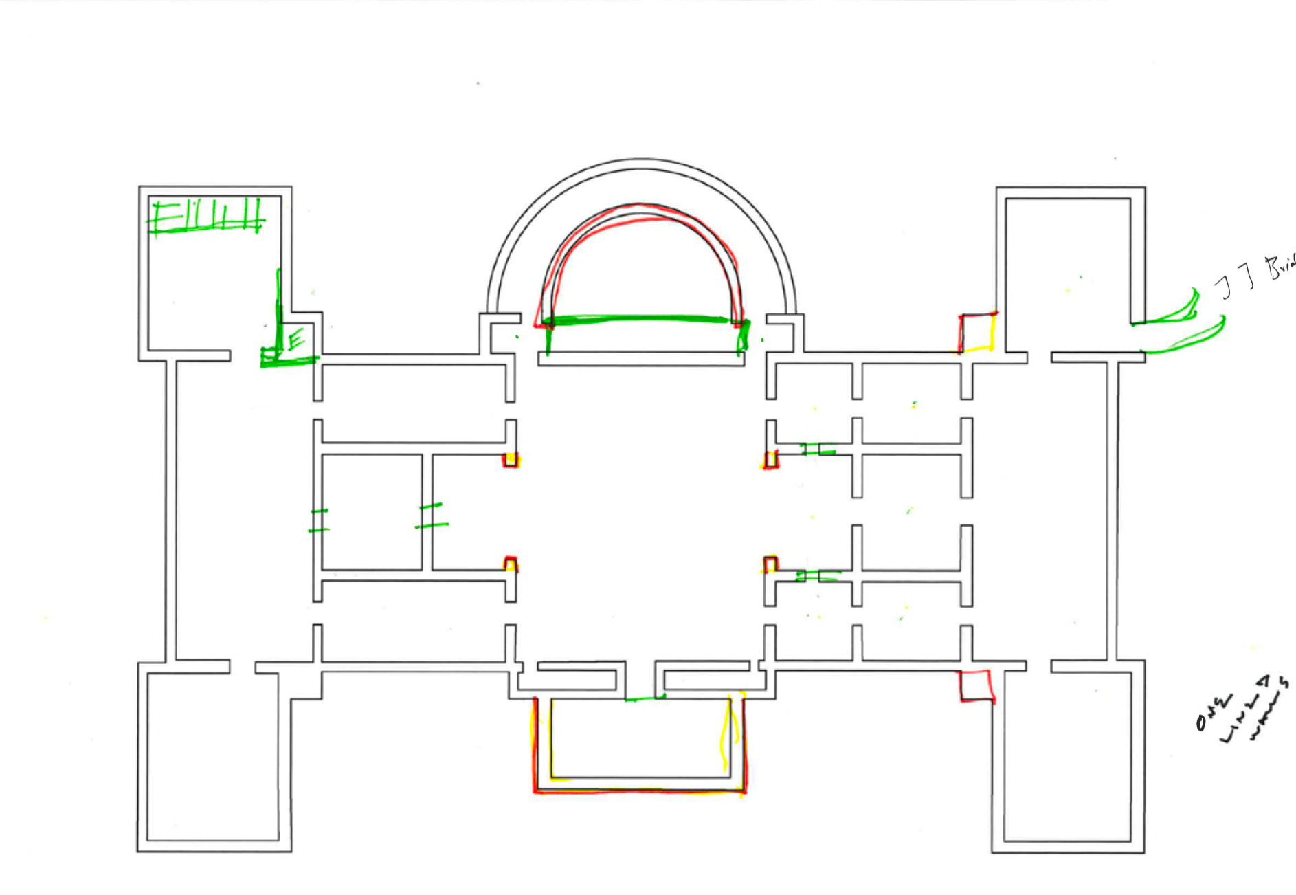
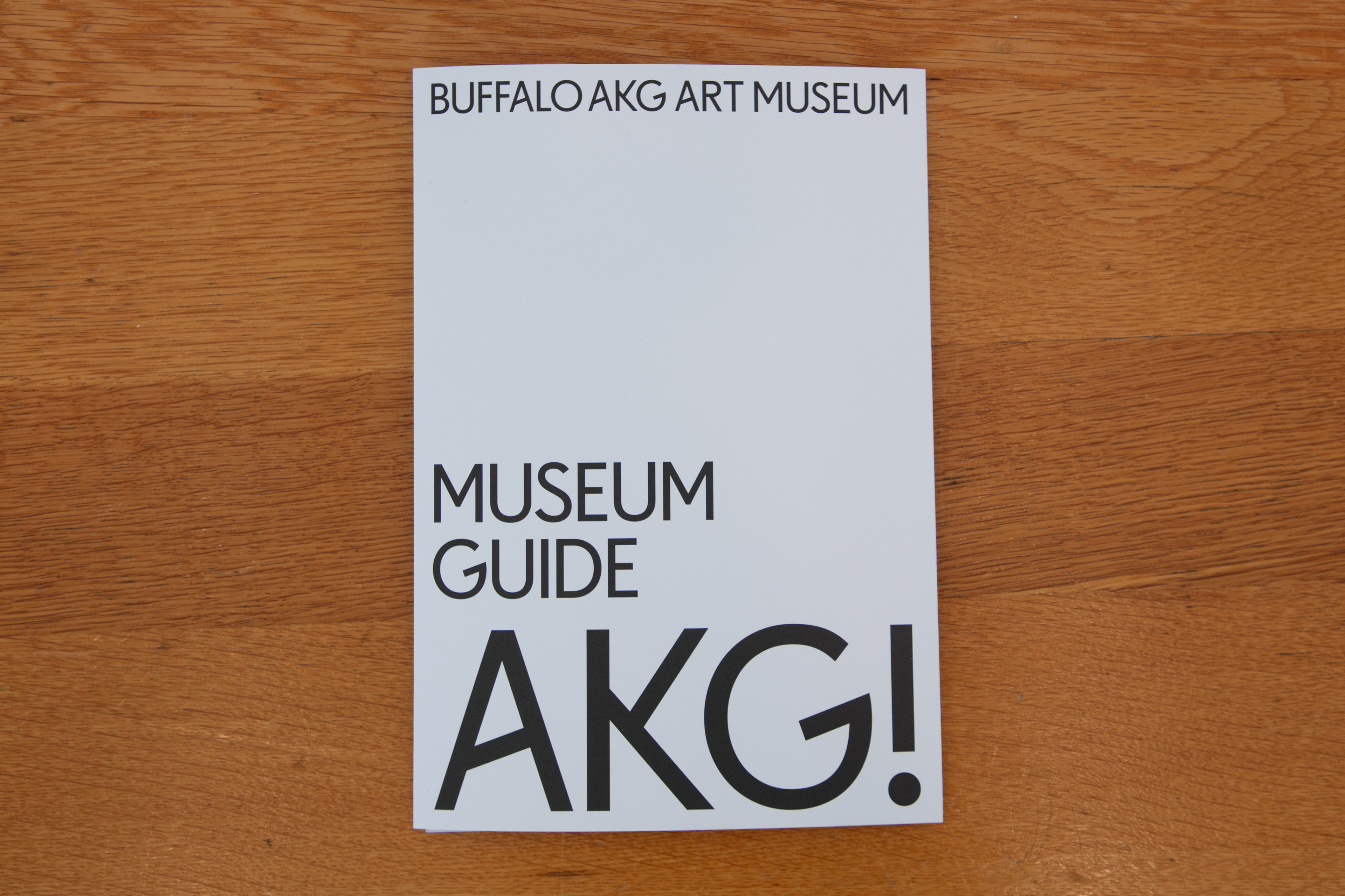
The most time consuming, and arguably the most important, of these projects was the visitor map. Myself and designer Katharine Wimmett worked to develop a map of the entire campus which includes three separate multi-level buildings as well as a parking garage and outdoor walkways.
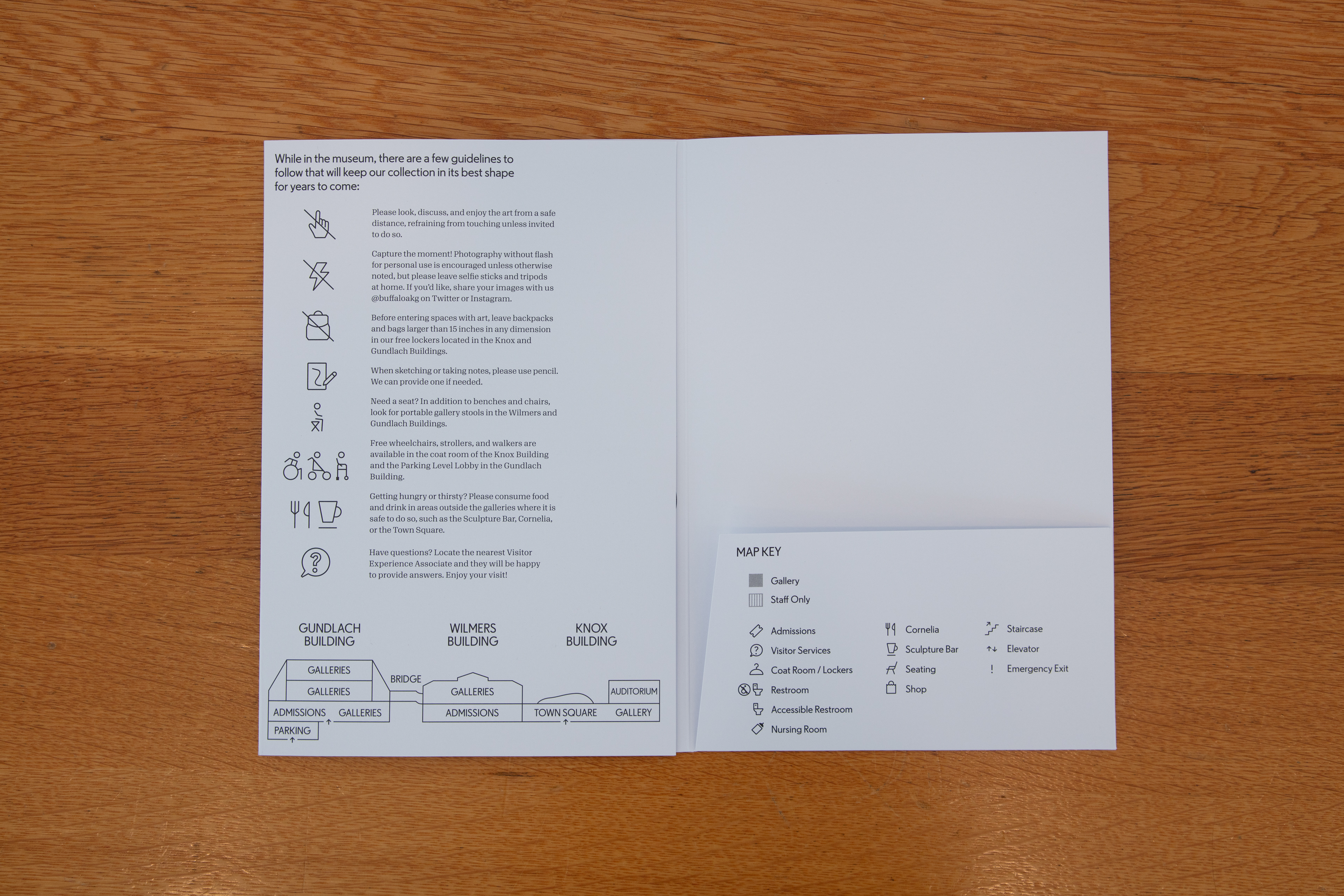
The map became a beautiful and multi-functional print piece that gives visitors all the tools they needed to navigate their time at the museum. It has continued to prove it's worth by giving us a kind of home for all other takeaways we produce for visitors. The trifold print piece with an inner pocket allows visitors to easily carry any other takeaways they gathered throughout their visit. It also helped us standardize sizes of print pieces, and gives us a reason to be choosy about how many printed materials we produce given the space available in the pocket.
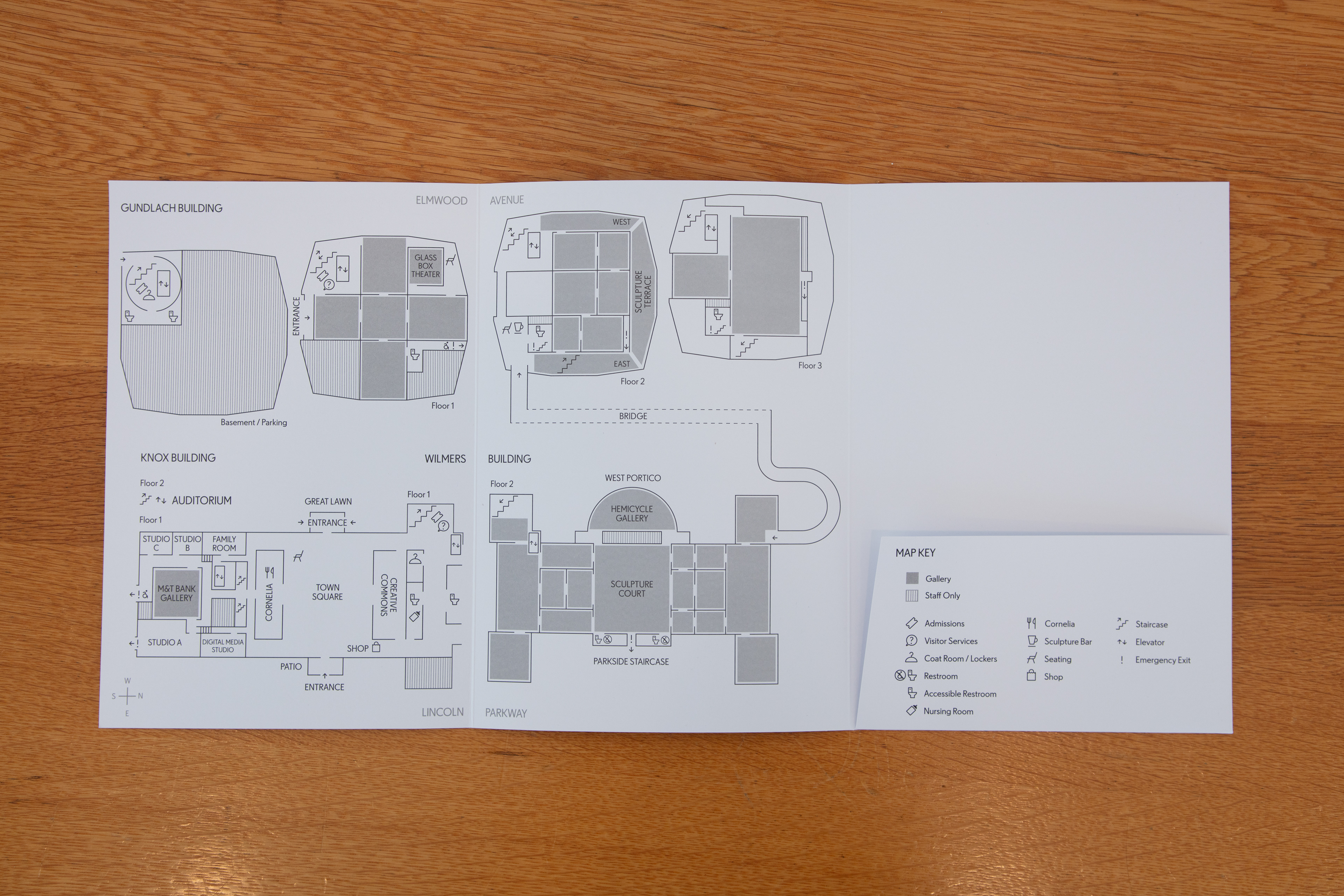
We started by looking at architectural drawings of the campus and marking what details needed to be included. Then we made simplified tracings which then proceeded to go through rounds and rounds of edits. We spent a lot of time meeting with each department to make sure all the necessary information and pieces of the buildings were included.
After getting the diagrams as close to perfect as we could (the actual buildings weren’t completed at this time), we fit them into our physical print layout.